Wednesday, 19 September 2012

Our Concept Inspiration

Zombies are fictional undead creatures which are usually en counted in horror and fantasy. They are also known as mindless, reanimated corpses with a hunger for human flesh. Most 20th century ideas about zombies were from Frankenstein by Mary Shelly.  Zombies are also known as ghouls because the name zombie is unclear. We have taken inspiration from a variety of media to help us develop our own unique zombie ideas:


'Shaun Of The Dead'

http://www.youtube.com/watch?v=t--mSXDeETc

We struggled to think of a efficient way to portray social zombies without extravagant sets and an unlimited budget. With a little advice we are taking inspiration from the first few minutes of 'Shaun of the Dead' the 2004 spoof zombie film directed by Edgar White. At the beginning of the film, although an infection has not yet spread, the people of London are shown as social zombies due to there repetitive every-day roughteen and overall monotonous lives. The protagonist, Shaun, is so much of a social zombie it takes him a good 15 minuets of the film to realise a infection has spread the city (http://www.youtube.com/watchv=mqQ8Y9Sjp7o&list=PLA4D602E0BDEEB70E). I love the advert for this film (perticualy the use of bright and dull colour) and think it does a superb job of presenting this element of the film.
          When using this film as inspiration it is essential to remember that this is a comedy and so we do not want to study the media techniques used too closely as we need to recognise most of them have been used for comic effect. I have noticed however that social zombies are portrayed through through slow camera movements, dull mies en scene and characters acting with a repetitive nature. The characters in the screenshots i have chosen seem to mirror each other suggesting they are all essentaly the same and have no individuality  This is what we hope to achieve when creating our own social zombies. It will probably be much harder for us to show this in a music video, as we have to show in 10 seconds what a film would in half an hour but with cearfuly planned filming and editing i think this is achievable.

< I perticualy like this screen shot as the door frame seems to box in the characters suggesting they are stuck in both a mental and physical rut; and that even though they could walk through the door frame, they do not, just as they have opotunitys to brake the monotony of there lives, they choose not to. This is in keeping with the conversation in this scene. I like this idea and hope to use a similar one to show how the zombies in our video are also trapped.


'[*REC]'

http://www.youtube.com/watch?v=xks0qWq7CQI

[*REC] is the 2007 film directed by Jaume Balaguero and Paco Plaza and is a Spanish horror/thriller filmed compleatly filmed by a hand heled camera. I liked how this technique adds an element of tension and panic to an already chaotic plot.
I really like this technique as we want to portray a hectic, frenzied representation of zombies. In [REC*] there are many other camera angles and techniques such as canted angles and very fast pans and tilts (temporally blurring the image, adding to the sense of confusion). Because we have planned very fast editing for our video I think it would be good to add some of these methods to create the right mood and hopefully make our video memorable.

Videos that have inspired us!

Sandi Thom, 'Lonely Girl'

http://www.youtube.com/watch?v=gYCttCTr_jo

We took inspiration from Sandi Thom's music video "Lonely Girl". Although it is in a different genre, we wanted to get a similar message across.

In the video, the girl feels like nothing is going right for her and that she is alone and invisible. Later on in the video, she is shown as becoming the ghost of who she used to be.

She wants to be noticed, whereas, our protagonist wants to blend into the crowd and to feel like everyone else.


We would like the audience to feel a similar connection to our character, As well as feeling sympathy towards towards her, like they would in this video.


Facebook Group


We created a facebook group as an easy way to communicate all the time. Through the group we can post comments and queries, photos and invite other people (such as our actors, reminding them when/where/why we need them) etc.


Monday, 17 September 2012

Advert 5 - The Blackout

This advert shows the two main singers in The Blackout. We would like to show just our lead singer in our advert because we would like to go along with this convention, however, we don't want our advert to look too feminine so I think that if we use an effect it could work quite well.

The advert is quite simple, it has an image of a drawn city in the background and the two singers in the foreground singing very passionately into microphones. I have found that in a lot of rock themed products, the artists are focused intently on their instruments rather than on the camera, which is uncommon in most other genres. I feel this gives the band a sense of caring more about the music they are creating and less about what the audience thinks. However, I think that maybe their attention needs to be a bit more focused on the audience in order for the audience to want to buy their product.

I liked the yellow writing on the poster as it stood out strongly from the black background and also it is reflected in the windows of the city. We thought we could use this idea but use red instead of yellow as it is a strong colour and it fits in more with our song.

We thought that having our advert almost the same as our digipack (like in this advert and digipack) would be a good idea because it would make sure the audience knew they were meant to be together. We thought we could have both the advert and digipack using the same effect and the same colours and also the logo clearly shown.

Thursday, 13 September 2012

Advert 4 - Avenged Sevenfold


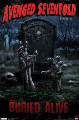
I love this advert, it is for Avenged Sevenfold's single 'Buried Alive' from the album 'Nightmare'. I think it is perfect for our project and even though it is more like a film poster I feel our project has many film-like elements so this poster is in keeping with our plans.
          This poster stands out due to the way it brakes the conventions of a music advert and follows the layout of an old horror film poster. This cultural reference to 50's and 60's American horror/thrillers is iconic not only in America but around the world as the posters could be considered works of art, even if the films are long forgotten.
Illustrated adverts are quite common in rock, mimicking other conventions of the genre such as tattoo designs and illustrated album cover art. I hope to be able to use some element of this when making our advert/digipack.


Advert 3 - Guns N Roses

We liked this advert because we liked the idea of having a film poster theme. We wanted to give our advert a 70's style because a lot of zombie films were made around that time. The colours used  will work well with our genre and music video as they are dark and quite gothic. Also, the blood coming off the letters would work well and look good when put together with our music video.

Advert 2 - Paramore

We liked the idea of our advert being black and white because we feel like it would give our advert a timeless effect. Also, by looking at the advert above, we realised what we need to include and how we would include it. We thought this was suitable because we don't want our advert to be too complex and the bottom one isn't.

We liked the idea of the dolls because they gave a sense of innocence that we may like to include in our advert. However, we would like to have just the lead singer on it and not the whole band. 

Advert 1 - Halestorm


The lighting in this advert is quite dark. This is to show that the music the band plays is rock because rock music is often quite heavy and quite dark. Also, the name of the band is Halestorm which can be interpreted as hailstorm which makes people think of dark, aggressive weather which suits the genre. 

The lead singers facial expression suggests that she is in pain or is very passionate about the music she plays she also looks quite seductive. This is suitable for the genre as a lot of rock music is very expressive and emotive and it is a male dominated genre, so men will be more likely to pay attention if the woman is looking this way. Also, it is very stereotypical of women as they are known to be more open about their feelings. Whereas if it were a man on the advert they would be more like the aggressive side of rock; they would face the camera straight on to emphasise their masculinity. However, the woman in this advert is slightly turned so that the audience can see her profile and see that she is more feminine and vulnerable.

The guitar in the background shows that although it's a male dominated genre, she wants to be taken seriously and she knows she is just as good as the male singers in this genre.