Friday, 30 November 2012

Photoshoot

Before our photo shoot we felt we needed a better knowledge of how to direct our models and so chose to look at how other rock bands, especially those with a female singer pose. We used Google to find some images that show conventional poses to help inspire us:

  
For the individual shots of Jess we looked at Taylor Momsen's typical poses, closeups of just her head and shoulders. we took note of the messy hair and angular shapes she makes with her body, in particular her arms and decided to direct Jess to do the same.


Because we wanted a more equal band (not just a lead singer with a nameless band behind her) we decided to focus more on Halestorm for the band poses as we feel they seem to have a sense of band-togetherness which the Pretty Reckless does not have. Here the lead singer is dressed the same as the rest of the band but is still at the forefront of the band. In some of the photographs she was leaning into the camera and we like this pose as it makes the image stand out.

With this in mind we took our photos:


Wednesday, 28 November 2012

Discordia Logo: Further Development

While experimenting with effects on Photoshop (while working on our advert) we altered our band name logo so that the bold, solid underlining faded out and became transparent at the bottom. We really like this effect as we think this logo better communicates the band. The font and design reflect the hardcore, masculine genre but the now softened line reflect the female front-woman adding a slightly more feminine feel to a previously manly logo.
Before

After

Final Cut


We are really proud of our final cut! We feel we have developed all of our ideas fully now and have come so far from our rough cut. The changes we made in the school scene, by replacing what we had by graphic matches, sets a very high standard at the beginning of our video which hopefully is continued throughout. I think we have produced a meaningful, entertaining and professional looking product.

Overall we think our video runs very smoothly and is filmed and edited in a way apropreate to our genre. There are lots of similarities between our video and those we analysed at the very beginning of our project. We are very happy with the way it turned out and everyone we have shown it to have responded with positive and supportive feedback. The most satisfying outcome thing to come from our video is the responses we get from our our audience, as people seem genuanly entertained and fascinated when watching it.

Wednesday, 21 November 2012

Ending: Suggested Suicide

After we'd filmed the suicide scene again, our teacher pointed out that suicide was illegal. We thought that we would have to change the ending just a couple of days away from the deadline as we are unable to show anything illegal or inappropriate. However, after some research, we found out that actually suicide was illegal until the Suicide Act in 1961 where it was decided that those who did not succeed in the attempt would no longer be prosecuted.

http://en.wikipedia.org/wiki/Suicide_Act_1961

We were overjoyed by this discovery as it meant we could keep our current ending which means that we have more time to concentrate on the other scenes that need attention.

Tuesday, 20 November 2012

Band Name Logo

We had a basic idea of what we wanted our band name logo to look like (from the already existing band logos we looked at) but we soon found out that finalising our own was a lot more complicated! 

1st Draft
We liked the bold, dark colours, conventional of rock, and knew we needed to incorporated a third colour to add a more impact to our title so it looks a little less 2D. We didn't think the red quite captured the look we were going fore and the overall effect looks very flat.

2nd Draft
For the next draft we took away the red, keeping it simple. We added a slight grainy effect to the grey to give the effect of shadow or perhaps even dirt. We liked this as we feel it reflects the dark and sometimes scruffy conventions of rock. Although we liked this we still felt we needed to neaten it up.
3rd Draft
We also decided to take away the colour from the moon shaped 'C'. The letter 'C' in our title is in the middle of the word and already has attention drawn to it due to its shape. Something we have learnt thorough out this project is not to do anything half-heartedly so we dicided to make it stand out even more  In our advert and digipak we are considering the idea of making the moon transparent to add that little extra something to our logo.
Final Draft

Monday, 19 November 2012

Re-filming Narrative - School Scene (2)

We felt the school scene was the weakest scene in our video and so tried to think of ways to stylize it to make it look more professional. After an in depth discussion including peers and teachers we came up with the idea of a series of graphic matches (or graphic graphic matches as our teachers came to call them), in which a student is doing something completely normal but the shot then cuts to them doing something violent or gory as a zombie.
I drew up a quick story board to help us visualise what we are doing:


The filming itself went very well. We worked out a system where we would film one or two students at a time around the desk in a way that allowed us to keep the actors with their zombie make up done already out of the shot. Our two mane conserns while filming were:
1 - actors move as little as possible while there makeup is being done
2 - DON'T MOVE THE CAMERA! 
This was possibly the most challenging thing we have done, not only in this project, but in the whole of our media course to date. It was essential that we got everything right first time as we only had one chance to do it. We were sure to brief our actors beforehand, telling them what we were doing and why and trying to explain what it would look like after it had been edited. It was essential for our actors to understand this so they had a better understanding of what we were trying to achieve and what we were asking of them.

I think the filming went very well and we are really pleased with how similar the shots turned out:

We linked each graphic match with an extreme close up of Emma's eyes so we could edit this footage like a series of eye line matches, this will help our audience see the world through our protagonists eyes. 


Overall this scene went very well and a little part of me cant believe we actually pulled it off! this scene really challenged are organisational skills, attention to detail (like meis en scene and the slightest camera movements), special effects skills and editing skills. We are really pleased we took this last minuet risk as it really pays off and makes our video look so much more proffetional (as well as helping it make a lot more scene).

Re-filming - Performance

I feel this shoot went really well as we had considered the fine details such as lighting and set design as well as the more obvious like camera angles and movements and basic mise en scene.
Because our last shoot was overexposed (which made our video look very unprofessional and became an issue when editing) Catherine was taught by David, our lights technician, how to use the lighting equipment in the drama hall so we could get it perfect. This worked out much better for us as we had a much clearer idea what sort of lighting we wanted than David did.

We added much more decoration to our performance, partly due to having a clearer idea of what our target audience wants, and partly because we have developed our project ideas dramatically in the past couple of weeks. We decided to add a logo on the drum kit, a convention of band performance of every genre. By putting a heart on the drums we played with the idea of a 'beating heart' suggesting that even though the drums are always in the background they are a vital element of a band and are the heart of this bands dynamic.


We also found perfect blood red leaves which we scatted at the feet of our band, as leaves and autumn are a recurring feature of our video, representing the decay of nature similar to the decay of the human body and mind.


Although we had included the conventional close ups on our lead singer we decided to include closeups on our bands faces, to give the other band members a more active role in there music video. This makes the video more realistic as although the lead singer of a rock band is always the center of attention they would be nothing without the music, including the people playing them - in our new cut we made an effort to reflect this in the video.
We tried to include them early on in the video to act almost as an establishing shot of each band member.


Because our last set was so plain we added a simple background to add a but more depth to the proformance. We built up the rostra in the drama hall and draped red ribbon and fabric across it to represent blood. we have tried to make this rather violent concept quite feminine by using soft imagery. In some ways the industrial rostra represents the men in the band and the fabric represents our female lead who, even though she is outnumbered is still the center of attention.


Friday, 16 November 2012

Ideas for Advert...

After looking at a variety of adverts from our genre we had already decided that the simplistic compositions looked the best. We want to use mostly black and white images, including some colour to emphasis certain aspects of our band image/album theme.
We have thought about a simple black and white image of our lead singer (similar to the Halestorm advert) but with Jess in the center of the photograph, holding our sacred heart in the same place as her own heart. To see what this image would look like I drew up a quick sketch:


We like this image and think the black and white vs colour makes our image stand out (and hopefully it would make a very noticeable advert) the religious imagery would help our advert become more memorable  I like the idea of using religion as a theme in our project as it is a common theme in most rock music. We also want to advertise that our music is so good/intense that you will want to follow it like a religion.

Developing Our Band Name/Logo

Wednesday, 14 November 2012

Re-filming Narrative: School Scene

It was a relief to know that our audience liked all of our zombie footage so we didn't have to go to all the effort to go through makeup all over again (defiantly the most time consuming part of our filming!) But we still faced some problems with this shoot. Even though we had messaged everyone on Facebook asking them to help us again, people were not as reliable as we had hoped...


On Facebook everyone agreed to help, we offered them sweets and pop as a thank you and said they could keep the t-shirts we bought for there costumes. Even though people had other arrangements they said they would try and make it, even if only for a few minuets  Most of our actors came through for us and although some of them had to travel from work etc they still made it on time. However there were a couple of members who did not show up, including our lead actress. We had tried all day to get in contact with her but at 4 o'clock we knew she was not going to show.

Although we had problems, the deadline is too close for us not to get any footage and we are not sure when we will be able to use the cameras again so we filmed what we could, but not nearly the amount that we wanted. We were only able to get a few shots on this shoot but a few is better than none.

The shots we did get we are happy about as we were able to work around Emma not being there by using a P.O.V. shot. We used a low angle to show her intimidation and possible fear and to show the power that the bullies had over her.


Saturday, 10 November 2012

Re-filming Narrative: Ending

We faced unforeseen problems when filming the ending of our video and so have changed and improved a few details that allow us to keep our ending and help us show what we want to get across much better.


The main problem was that we wanted out lead actor to pretend to vomit the blood concoction we had made which, naturaly, was very unplesent for her(as it was made mostly of ketchup and BBQ sauce). Because of this we could not get the shots we needed in our original shoot.
Our new plan was to get her to pretend to vomit melted blackcurrant sorbet, which she will like much more and it still looks like blood. I feel our new shots work very well and we do not need anything more for this scene.


One of our main concerns was the amount of comments we got about the location of our videos. We wanted the places to look dull, ordinary and vaguely suburban, while also looking intimidating  We chose this bridge as we feel it has all these quality  the old brick and concrete look is pretty common in housing areas but the graffiti, dead leaves and the shadows of the metal fence add the sinister and stylised effect we are looking for.

I love the tall shadows the fence has made, reminiscent of prison bars, which links to our theme
of being trapped or restrained by society and your own fears.


People commented on the hand dropping the empty packets of pills at the end of our video (stating it looked like a very unatural drop) so we knew we needed to re-film this shot. The new shot is very smooth and we have also decided to fade to black at the end of our video to mimic the way our protagonist slips out of consciousness  As we have followed her through her day, seeing the world through her eyes it is only fitting that we exsperiance what she if experiencing at this point in time. This will finish off the video nicely, adding a more finalized feeling to the end.

Wednesday, 7 November 2012

Band Name

Lilith
http://en.wikipedia.org/wiki/Lilith
Finally we have organized our thoughts enough to come up with a two possible band names to pitch to our target audience. We have carefully and thoroughly researched our ideas to back up our concepts and designs.
By meeting and talking with members of our audience we came up with the ideas of many goddesses of evil and chaos such as Lilith (the mother of all daemons according to Jewish Mythology), Kali (Hindu goddess of destruction) and Eris (the Greek goddess of chaos). I liked these as they each had there own symbol and story that we would be able to incorporate in our project.


Eris
http://en.wikipedia.org/wiki/Eris_(mythology)
 We paid particular attention to Eris as the more we researched her the more we liked: The Greek Goddess of Chaos, daughter of the Goddess of Night. Her name in Latin is Discordia a word which as soon as we heard it we fell a little bit in love with. I like the links we can make with it but also the way we can make a musical link to the word, pronounced dis-chord-i-a.


We asked our target audience to chose between the names 'Goddess Of Chaos' and 'Discordia'. We made a tally chart of the results which I then put into bar charts:


As you can see more than half our target audience preferred Discordia to Goddess of Chaos. We are pleased with the results of this audience research and are looking forward to developing a clear brand for out band.
I have already tried creating rough logos/band name images, incorporated what we learnt from our research. I have used Erises symbol, the spikes and ridged edges of which fit our genre very well in my opinion. I have incorporated the moon of Lilith's symbol as Eris was the daughter of the Goddess of Night. The moon also links into our band image as the song we have chosen is dark and about the supernatural, both of which are associated with night.
For our font and style we took inspiration from a range of rock bands:


Some fonts and compositions we liked more than others but by using bands like this we were able to spot common conventions. We noticed the newer, more current bands take inspiration from the classic, iconic bands. For example both Bullet For My Valentine and Papa Roach have taken inspiration from Metallica's spiky 'M' and 'A' at the beginning and end of the name but adding there own style. It seems bands of the same genre will take inspiration from those who came before them, in sound and in style. We need to think carefully about who inspires our band to help us define the overall look of our digipak and advert, including things like album art, photography and font.
We noticed that most of the names were written in block capitals and the use of ridged, often sharp lines conveyed the violent and controversial image that rock creates. Because we are a band with a female lead we have to be very careful not to make our font too masculine. For that reason we like the softened lines that Papa Roach and The Pretty Reckless (and perhaps also Bullet For My Valentine) incorporated in there names.
We also took notice of the way some letters were made bigger than others, adding a stylized effect and making the name stand out. We liked the names with a larger letter at the beginning and end of the name as it looked more organised while still looking bold with a definite scene of confidence. We will defiantly use this for our final font.
We particularly liked the way the Papa Roach, ACDC and Metallica logos had that little something extra to make them more dynamic. I love the, almost Gothic, underlining that Papa Roach uses and this has inspired me to incorporate Eris' symbol as an underlining.

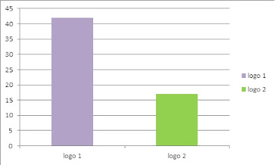
Again we gave our target audience two options to chose from:

Logo 1

Logo 2

As you can see we also chose to use the moon in the center of Lilith's symbol to link it back to the supernatural and adding a spooky feel.
Again our target audience was very opinionated and it became very clear when collecting our data that they had made there choice. Logo 1 was probably the more complex design of the two, a look that our audience responds well to.


Now we will start to make our advert and digipak using the chosen logo. We have also have plans to incorporate our heart that I designed into both these products.