| Lilith http://en.wikipedia.org/wiki/Lilith |
By meeting and talking with members of our audience we came up with the ideas of many goddesses of evil and chaos such as Lilith (the mother of all daemons according to Jewish Mythology), Kali (Hindu goddess of destruction) and Eris (the Greek goddess of chaos). I liked these as they each had there own symbol and story that we would be able to incorporate in our project.


| Eris http://en.wikipedia.org/wiki/Eris_(mythology) |
We asked our target audience to chose between the names 'Goddess Of Chaos' and 'Discordia'. We made a tally chart of the results which I then put into bar charts:
As you can see more than half our target audience preferred Discordia to Goddess of Chaos. We are pleased with the results of this audience research and are looking forward to developing a clear brand for out band.
I have already tried creating rough logos/band name images, incorporated what we learnt from our research. I have used Erises symbol, the spikes and ridged edges of which fit our genre very well in my opinion. I have incorporated the moon of Lilith's symbol as Eris was the daughter of the Goddess of Night. The moon also links into our band image as the song we have chosen is dark and about the supernatural, both of which are associated with night.
For our font and style we took inspiration from a range of rock bands:

Some fonts and compositions we liked more than others but by using bands like this we were able to spot common conventions. We noticed the newer, more current bands take inspiration from the classic, iconic bands. For example both Bullet For My Valentine and Papa Roach have taken inspiration from Metallica's spiky 'M' and 'A' at the beginning and end of the name but adding there own style. It seems bands of the same genre will take inspiration from those who came before them, in sound and in style. We need to think carefully about who inspires our band to help us define the overall look of our digipak and advert, including things like album art, photography and font.
We noticed that most of the names were written in block capitals and the use of ridged, often sharp lines conveyed the violent and controversial image that rock creates. Because we are a band with a female lead we have to be very careful not to make our font too masculine. For that reason we like the softened lines that Papa Roach and The Pretty Reckless (and perhaps also Bullet For My Valentine) incorporated in there names.
We also took notice of the way some letters were made bigger than others, adding a stylized effect and making the name stand out. We liked the names with a larger letter at the beginning and end of the name as it looked more organised while still looking bold with a definite scene of confidence. We will defiantly use this for our final font.
We particularly liked the way the Papa Roach, ACDC and Metallica logos had that little something extra to make them more dynamic. I love the, almost Gothic, underlining that Papa Roach uses and this has inspired me to incorporate Eris' symbol as an underlining.
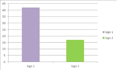
Again we gave our target audience two options to chose from:
 |
| Logo 1 |
 |
| Logo 2 |
As you can see we also chose to use the moon in the center of Lilith's symbol to link it back to the supernatural and adding a spooky feel.
Again our target audience was very opinionated and it became very clear when collecting our data that they had made there choice. Logo 1 was probably the more complex design of the two, a look that our audience responds well to.
Now we will start to make our advert and digipak using the chosen logo. We have also have plans to incorporate our heart that I designed into both these products.


No comments:
Post a Comment