Wednesday, 14 November 2012

Re-filming Narrative: School Scene

It was a relief to know that our audience liked all of our zombie footage so we didn't have to go to all the effort to go through makeup all over again (defiantly the most time consuming part of our filming!) But we still faced some problems with this shoot. Even though we had messaged everyone on Facebook asking them to help us again, people were not as reliable as we had hoped...


On Facebook everyone agreed to help, we offered them sweets and pop as a thank you and said they could keep the t-shirts we bought for there costumes. Even though people had other arrangements they said they would try and make it, even if only for a few minuets  Most of our actors came through for us and although some of them had to travel from work etc they still made it on time. However there were a couple of members who did not show up, including our lead actress. We had tried all day to get in contact with her but at 4 o'clock we knew she was not going to show.

Although we had problems, the deadline is too close for us not to get any footage and we are not sure when we will be able to use the cameras again so we filmed what we could, but not nearly the amount that we wanted. We were only able to get a few shots on this shoot but a few is better than none.

The shots we did get we are happy about as we were able to work around Emma not being there by using a P.O.V. shot. We used a low angle to show her intimidation and possible fear and to show the power that the bullies had over her.


Saturday, 10 November 2012

Re-filming Narrative: Ending

We faced unforeseen problems when filming the ending of our video and so have changed and improved a few details that allow us to keep our ending and help us show what we want to get across much better.


The main problem was that we wanted out lead actor to pretend to vomit the blood concoction we had made which, naturaly, was very unplesent for her(as it was made mostly of ketchup and BBQ sauce). Because of this we could not get the shots we needed in our original shoot.
Our new plan was to get her to pretend to vomit melted blackcurrant sorbet, which she will like much more and it still looks like blood. I feel our new shots work very well and we do not need anything more for this scene.


One of our main concerns was the amount of comments we got about the location of our videos. We wanted the places to look dull, ordinary and vaguely suburban, while also looking intimidating  We chose this bridge as we feel it has all these quality  the old brick and concrete look is pretty common in housing areas but the graffiti, dead leaves and the shadows of the metal fence add the sinister and stylised effect we are looking for.

I love the tall shadows the fence has made, reminiscent of prison bars, which links to our theme
of being trapped or restrained by society and your own fears.


People commented on the hand dropping the empty packets of pills at the end of our video (stating it looked like a very unatural drop) so we knew we needed to re-film this shot. The new shot is very smooth and we have also decided to fade to black at the end of our video to mimic the way our protagonist slips out of consciousness  As we have followed her through her day, seeing the world through her eyes it is only fitting that we exsperiance what she if experiencing at this point in time. This will finish off the video nicely, adding a more finalized feeling to the end.

Wednesday, 7 November 2012

Band Name

Lilith
http://en.wikipedia.org/wiki/Lilith
Finally we have organized our thoughts enough to come up with a two possible band names to pitch to our target audience. We have carefully and thoroughly researched our ideas to back up our concepts and designs.
By meeting and talking with members of our audience we came up with the ideas of many goddesses of evil and chaos such as Lilith (the mother of all daemons according to Jewish Mythology), Kali (Hindu goddess of destruction) and Eris (the Greek goddess of chaos). I liked these as they each had there own symbol and story that we would be able to incorporate in our project.


Eris
http://en.wikipedia.org/wiki/Eris_(mythology)
 We paid particular attention to Eris as the more we researched her the more we liked: The Greek Goddess of Chaos, daughter of the Goddess of Night. Her name in Latin is Discordia a word which as soon as we heard it we fell a little bit in love with. I like the links we can make with it but also the way we can make a musical link to the word, pronounced dis-chord-i-a.


We asked our target audience to chose between the names 'Goddess Of Chaos' and 'Discordia'. We made a tally chart of the results which I then put into bar charts:


As you can see more than half our target audience preferred Discordia to Goddess of Chaos. We are pleased with the results of this audience research and are looking forward to developing a clear brand for out band.
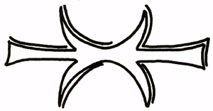
I have already tried creating rough logos/band name images, incorporated what we learnt from our research. I have used Erises symbol, the spikes and ridged edges of which fit our genre very well in my opinion. I have incorporated the moon of Lilith's symbol as Eris was the daughter of the Goddess of Night. The moon also links into our band image as the song we have chosen is dark and about the supernatural, both of which are associated with night.
For our font and style we took inspiration from a range of rock bands:


Some fonts and compositions we liked more than others but by using bands like this we were able to spot common conventions. We noticed the newer, more current bands take inspiration from the classic, iconic bands. For example both Bullet For My Valentine and Papa Roach have taken inspiration from Metallica's spiky 'M' and 'A' at the beginning and end of the name but adding there own style. It seems bands of the same genre will take inspiration from those who came before them, in sound and in style. We need to think carefully about who inspires our band to help us define the overall look of our digipak and advert, including things like album art, photography and font.
We noticed that most of the names were written in block capitals and the use of ridged, often sharp lines conveyed the violent and controversial image that rock creates. Because we are a band with a female lead we have to be very careful not to make our font too masculine. For that reason we like the softened lines that Papa Roach and The Pretty Reckless (and perhaps also Bullet For My Valentine) incorporated in there names.
We also took notice of the way some letters were made bigger than others, adding a stylized effect and making the name stand out. We liked the names with a larger letter at the beginning and end of the name as it looked more organised while still looking bold with a definite scene of confidence. We will defiantly use this for our final font.
We particularly liked the way the Papa Roach, ACDC and Metallica logos had that little something extra to make them more dynamic. I love the, almost Gothic, underlining that Papa Roach uses and this has inspired me to incorporate Eris' symbol as an underlining.

Again we gave our target audience two options to chose from:

Logo 1

Logo 2

As you can see we also chose to use the moon in the center of Lilith's symbol to link it back to the supernatural and adding a spooky feel.
Again our target audience was very opinionated and it became very clear when collecting our data that they had made there choice. Logo 1 was probably the more complex design of the two, a look that our audience responds well to.


Now we will start to make our advert and digipak using the chosen logo. We have also have plans to incorporate our heart that I designed into both these products. 

Tuesday, 6 November 2012

The Next Step...

After receiving feedback we had a group meeting to discuss what we needed to do next: It became very clear half way through making our rough cut that we had gone from a four at the beginning of the year, to a three and now due to repeated absences an solitary two. Considering all the team issues we encountered I think me and Cat have done very well and we have no doubt that we will be able to complete our project on time, and to a high level of skill.

We have created a 'To Do' list and have already made the first step of booking the camera for re-shoots next week.

- Re-film performance
                                 - book light (for back lighting)
                                 - contact drama department
                                 - contact David (our light technician)
                                 - think about set decoration -> red ribbons etc

- Re-film parts of narrative
                                        - change some locations (emma walking)
                                        - re-film ending

- Start putting together Advert and Digi pack, using the inspiration we have found. We plan to create a advert/digi pack with the layout of a 50's film poster with the religious iconography that we have chosen to use for our band name etc. Whether or not that will work or not is unclear at this point but we plan to create a few drafts and ask our target audience.

We plan to keep the same roles we have adopted so far in the project (Cat: blogging, Rosie: editing) while working together on things such as the digipack and advert etc.

Rough Cut: Feedback

We were both really pleased with our rough cut and our feedback. Our target audience gave us some constructive critasisum as well as telling us what they liked, giving us a clear idea on how to more forward in our project.


We totally agree with what our audience thought and because of there feedback have also began to look at our work with a more critical eye and have come up with some changes that were not mentioned (a fade to black at the end for example). Hopefully our final cut will give us more of an oportunity to focus on effects and more complex areas of editing that were overlooked in our rough cut.

Rough Cut


Because our video has developed into a completely different video from our animatic I feel I should go over the narrative briefly to make sure the message has got across:
Their are two kinds of zombies in our video; social zombies (e.g. our protagonist) and stereotypical zombies (the monsters our protagonist sees normal people as when she sees them as immoral or frightening). Some could interpret this as our main character as suffering from anxieties and/or depression as she fails to see the humanity in people in every day situations and seems isolated from all the other people in our video. This is why after seeing herself as a monster she decides to take medication. Our ending could also be interpreted in different ways, she could be taking medication for her mental disorders or she could be overdosing on medication.  
We reinforced the ideas we had about being trapped by incorporating bars and fences throughout our video. An audience may not pick up on this but will hopefully pick up the subliminal message of the girl being trapped in society or trapped in her own head. 

For a rough cut we feel our video looks pretty good. All our edits are smooth (if perhaps simple) and our story is clear and easy to understand. We feel our video lays a good foundation for our final cut and there is not too much we need to improve on. We just have to work to make our video look more preferential by working into it more, using the audience research we receive from this cut to perfect the work we already have. This may evolve re shooting some scenes or even scraping some parts entirely but we are sure it will be worth all the effort for a high quality outcome.

Wednesday, 24 October 2012

Digipak Ideas


We had rough idea of using the different layers of the digipak to show they different layers of skin coming off. Like a zombie. Also, this could symbolise the different layers of a persons personality and how they are completely different people underneath all the 'make-up' (who they pretend to be). This idea was about the singer expressing her feelings and exposing who she really is.


Rosie came up with the idea taken from sacred hearts about barbed wire around a heart. It fits in with the rock genre and also it has a lot of meanings to it. It also suits our song choice and the video.  The barbed wire around the human heart is used to symbolise how Jess (the lead singer) tried to protect herself but ended up getting betrayed anyway. It could also show how the people in our narrative are trapped or must be restrained, like animals in a cage.

The Sacred Heart:
The sacred heart is a christian symbol representing Jesus' love and devotion to humanity. It is often depicted in art as Jesus holding his own heart in his hands, offering it to mankind.

I like the way this meaning and imagery can be used and in some ways contrasted with our concept. Anyone familiar with the sacred heart will understand how we have used the brutal image of a flaming and severed heart, wrapped in thorns that, as violent as the image is, symbolizes a love of humanity to question the idea of humanity itself. In our video we have shown the immoral people as zombies, however this could be interpreted as all humans have this animal inside of them, as our protagonist soon discovers. However we have also presented the idea that all humans are trapped (similar to the heart surrounded by thorns) and need help to be free, similar to the help religion provides, and perhaps we are all just lost and need to be found. The end of our video supports this as we imply that our protagonist commits suicide. She could be doing this to escape the her life and the fear and sadness she experiences every day or she could be going to the afterlife in the zombie Apocalypse that is taking place (similar to the Apocalypse in the bible, where the good descend to heaven).

I have based my design on the following images: 

In this image the thorns remind me of barbed wire, presenting a much more violent (and perhaps more modern and genre specific) image. It was this image that helped me define the thorns more as wire in my own, more styalised, sacred heart.  
This heart is similar to a tattoo design and appears much more feminine as the thorns are flowers and the overall image is much less aggressive, yet never the less striking. I like the idea of a tattoo design as tattoos are a common accessory of rock and many rock posters, albums and adverts are done by artists and inspired by tattoos. I have tried to make my heart like a tattoo drawing by simplifying it as only using the colours red, blue and black.

My Sacred Heart:
 I aimed to make my sacred heart less religious, more rock. I replaced the typical valentines day heart with a more accurate human organ, linking in with our themes of life, death, (undeath,) humanity and emotion. I then chose to replace the thorns with barbed wire to create a more striking image as barbed wire has many negative connotations such as war, death, imprisonment  confinement etc. This links in with our ideas about being trapped in a corrupted world or being trapped in yourself. Barbed wire is also a much more typical feature of both tattoos and rock.

We showed this logo to the target audience and got a very good response  people really liked the concept and said it reminded them of a tattoo degsine. Our audience said it was very striking and memorable so we have decided this will be the main feature of the digipack (and perhaps advert).